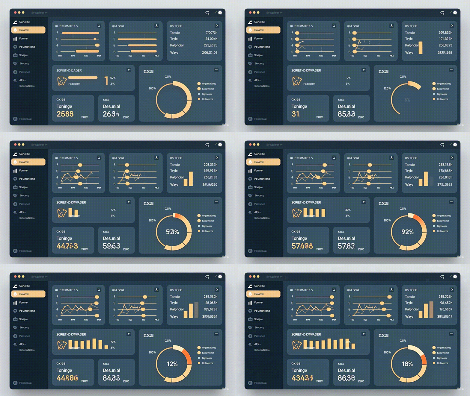


A practical, golden-ratio system to build calm dashboards that reduce noise, guide attention, and speed decisions.
If your product feels busy, calm dashboards are the antidote. This approach uses golden-ratio anchors (3/5, 5/8), one consistent gutter, and ruthless information triage so teams scan faster and click with confidence. I borrowed the same “pre-decision” mindset I use in layouts from my Golden Scaling in Practice post and applied it to analytics screens.
Crowding fractures attention. Calm dashboards establish one dominant element (headline/KPI), one supporting action (CTA), and everything else subordinate. This creates a reliable reading path and fewer hesitations.
Pin the headline to the 3/5 vertical and the primary CTA to the 5/8 horizontal. Choose one baseline gutter—8, 13, or 21—and stick to it across the screen. These rails remove most micro-decisions and give your interface a steady rhythm.
Sort every module into: Now (decision-critical), Next (context), Nice (reference). Now goes on your anchor lines; Next aligns to parallel rails; Nice is collapsible. This simple rule cuts clutter without cutting capability.
Limit the screen to one primary action; demote the rest. Prefer subtle motion only on state changes. Keep focus order left→right, top→bottom along your rails. For a second opinion on layout fundamentals, review Material Design’s layout overview and map its guidance onto your φ grid.
Before: center-stacked widgets, variable paddings, CTA shouting, three competing KPI rows.
After: headline on 3/5, KPI strip aligned to the 5/8 cross-line, filters on a parallel rail, uniform 13-pt gutter. Scan time drops; decisions rise.
Clone this recipe on one dashboard today: set φ rails, pick one gutter, triage modules, and run a squint test. Close by validating focus order with keyboard only. Download the Calm Dashboard Checklist and start removing noise on purpose.