
$0.00
A practical system for calm notifications—quiet defaults, clear priorities, and golden-ratio anchors that respect attention instead of hijacking it.
Most products over-notify because it’s easy to ship a ping and call it “engagement.” Calm notifications flip that impulse: fewer, clearer alerts that arrive at the right time, in the right channel, with the right tone. I use golden-ratio anchors (3/5, 5/8) to keep notification UIs visually steady, plus a ruleset that asks, “Will this help someone act in one move?”
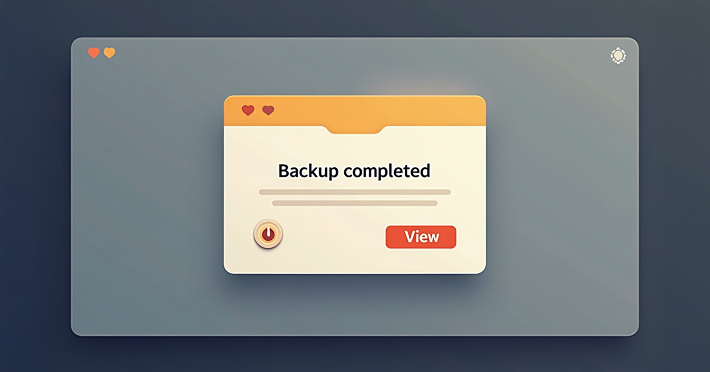
Loud alerts train users to mute everything. Calm notifications train trust. Start by classifying every event into: Now (needs action), Soon (needs awareness), Later (digest). Now gets a visible, actionable toast; Soon is a quiet inbox entry; Later rolls into a digest. This triage keeps signals crisp.
Anchor titles on the 3/5 vertical and primary actions on the 5/8 horizontal. Use one baseline gutter (8, 13, or 21) so multiple toasts feel related, not chaotic. I wrote about these rails in Golden Scaling in Practice—the same composition rules make alerts feel intentional.
Respect reduced motion; slide or fade with small distances only. Provide keyboard focus traps for destructive confirmations. Maintain WCAG AA contrast and 44×44 hit targets. If you need a wider UX example with list/grid toggles and status, see LifeOS Dev Log: Drive Tokens & List/Grid Toggle.
Close with one tiny experiment: pick a noisy alert, demote it to digest, and add a just-in-time in-app toast for the actual decision point. Watch completion rise and complaints fall.
— “Attention is a budget; design spends it on purpose.” - randomblink