Recents, Favorites, and Tag Filters That Don’t Fight Your Brain
A calmer file view for LifeOS—PARA-ish structure, faster list/grid toggles, and Drive metadata that actually helps you decide.
Why this sketch (and promise)
My Second Brain is two things:
- a part of an application I’m building (LifeOS), and
- a simple system for organizing anything, anywhere.
Since my strokes, I make better decisions with fewer choices on screen. This view is designed to remove friction: Recents, Favorites, and straightforward tag filters—sitting on top of a PARA-ish structure—so I can pick a file and move.
You’ll get: a visual model you can copy today, and a peek at how it lands in LifeOS.
The model (PARA + overlays)
PARA tiers
- Projects — time-boxed outcomes (draft a post, ship a feature)
- Areas — ongoing responsibilities (Finances, Health, Client A)
- Resources — reference you reuse (Design patterns, Prompts, Research)
- Archives — past work, completed, cold storage
Global overlays
- Recents — last 30 touched. Fast path to “what I was doing.”
- Favorites — manually starred items for the week’s focus.
- Tags — compact chips (topic, status, app). Use 3–7 core tags; more is friction.
Why overlays? Because Recents and Favorites are how I think in motion, not locations. And tags cut across PARA without breaking it.
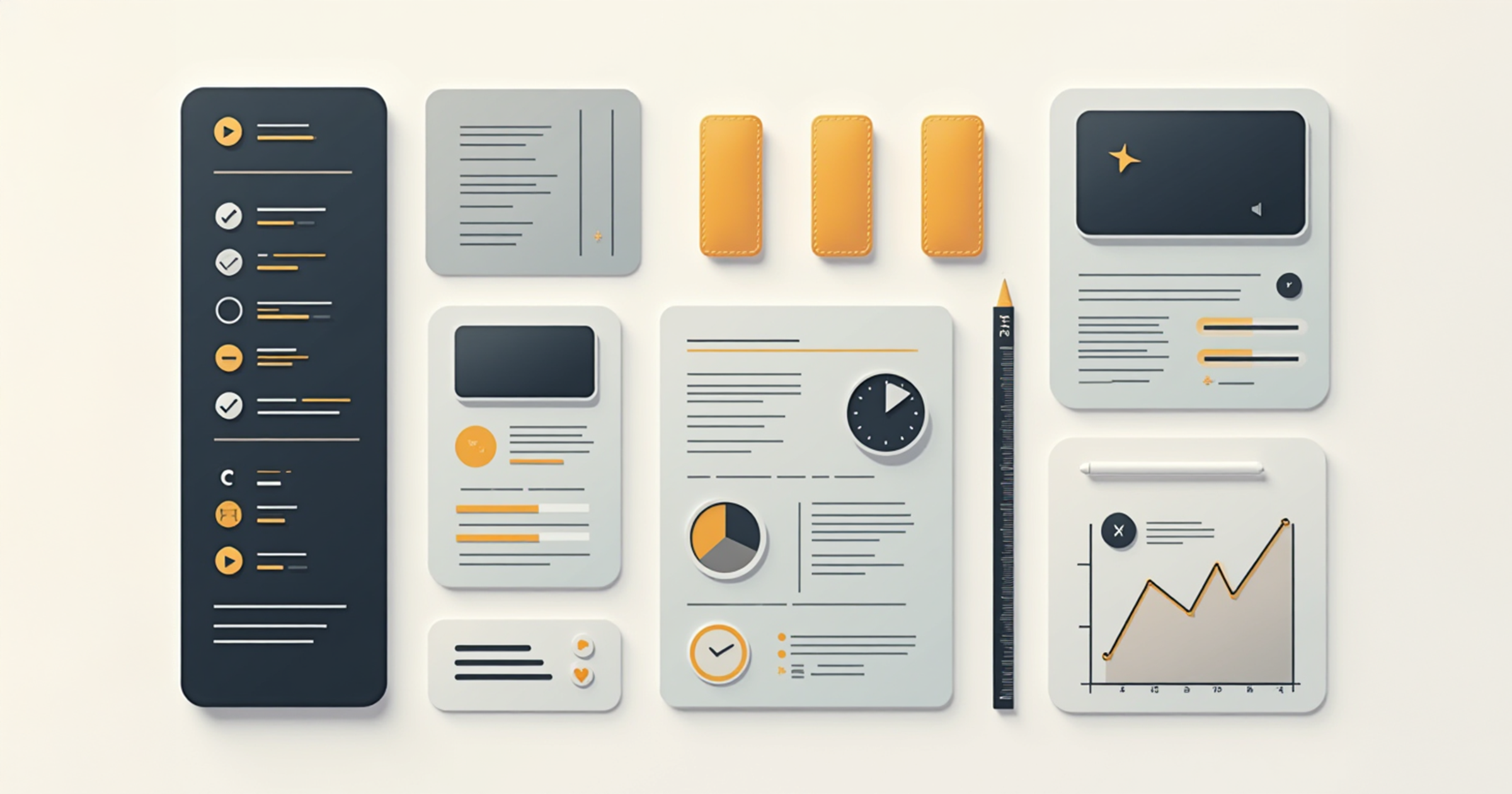
The view (don’t fight your brain)
List ↔ Grid toggle
- List for density (modified date, size, type inline).
- Grid for visual scan (thumbnails, shorter labels).
- Toggle persists per section (e.g., Projects default list; Resources default grid).
Metadata that matters
- Modified (primary), Type, Size (secondary).
- Progressive disclosure: show more on hover/tap or when the row is focused.
Quick filters
- One row of chips:
#writing #design #needs-review #clientA #pdf
- One “More…” popover for the long tail—never force a sidebar jungle.
How it lands in LifeOS (v0 sketch)
- Sections: PARA panes in the left rail; Recents and Favorites above them.
- List/Grid: segmented control in the header; persists by section via
UserDefaults.
- Drive metadata: size, modified, MIME type pulled via token-based REST (no GTLR).
- Thumbnails: lightweight preview for common types (images, PDFs, key docs).
- Tags: local + cloud; filter chips at top of content pane.
Tech note: LifeOS 0.1.0-dev (Swift 6, Xcode 16). Google Drive/Calendar v3 via REST + URLSession. Tokens in Keychain. No GTLR.
See also: /lifeos-scribraria-dev-log-1
A simple system you can use today (even without LifeOS)
- Create four top folders: Projects, Areas, Resources, Archives.
- Add a Recents smart view (or sort by modified desc).
- Add a Favorites star/flag.
- Pick 5 core tags (topic or status). Keep it small.
- Decide your defaults: Projects=List, Resources=Grid.
- Review weekly: unstar old items, archive done projects.
Accessibility & calm design choices
- Minimum 14–16pt labels; 44pt hit targets.
- One line of tags visible by default; scroll inside the chip row if needed.
- No color-only signals: use icons + text (★ Favorite, ● Modified).
- Keyboard first:
/ to search, g l list, g g grid, t to toggle tag focus.
What I’m testing next
- Thumbnail performance on large folders
- Tag suggestions from content (lightweight, on-device)
- “Session stacks”: an automatic bundle of files from the last 90 minutes
Call to action
What’s your must-have: thumbnails, tags, or modified dates?
Comment below (pick one), and I’ll tune the next build around it.
Internal & External Links
Update / Version Box (for version-sensitive posts)
LifeOS File View — v0.1 Sketch
- Build: 0.1.0-dev (Swift 6 / Xcode 16)
- Status: prototyping list/grid persistence, Drive metadata rows
- Next planned update: thumbnails performance sweep + tag UX polish
Signature
— randomblink
“Calm the screen, speed the decision.”