What these bright-eyed park acrobats teach me about design, focus, and building in public.
I’ll say it plainly: squirrels are my favorite animal. They’re everywhere and nearly invisible until you decide to see them. Once you do, you notice patterns—how they cache, how they rehearse routes, how they debug a leap before they attempt it. I started treating them like tiny mentors in a gray hoodie, and I swear my craft got better.
Why squirrels are my favorite animal (and what that reveals)
It’s not nostalgia; it’s mechanics. Squirrels model a loop I want in my work:
Scout: scan branches, pick a viable route.
Stash: cache today’s surplus for tomorrow’s unknowns.
Sprint: commit to a move without melodrama.
Scope: stop, reassess, update the map.
Share: chatter when danger’s near—lightweight team comms.
I use that loop to write chapters, tweak LifeOS, and survive “cracking lost” days. The loop is calm. It’s iterative. It’s enough.
How squirrels are my favorite animal shaped my design brain
Watch a squirrel on a fence line. They favor waypoints—posts, knots, corners—and they keep them close enough that a single miss won’t be fatal. That’s a product roadmap:
Ship to the next post, not across the entire yard.
Allow a safe fallback (branching, feature flags).
Cache as you go: notes, snippets, test data.
In LifeOS, that means thin slices with visible waypoints: a List↔Grid toggle that persists; a metadata row that reads well at narrow widths; a token flow you can reason about on paper.
Where squirrels are my favorite animal leads in writing
Drafts are caches. Scenes are branches. I quit trying to “fly” a whole chapter in one go. I build landing spots: a true line, a beat that clicks, a reveal that earns its jump. If I miss, I can grip the last good sentence and try again. Squirrels don’t apologize for taking two hops.
The squirrel’s rule of play (and why it’s strategic)
They chase each other, pause, spiral a trunk, vanish, return. That’s not wasted motion; it’s skill rehearsal under joy. Builders forget this. If everything is grim, we hold our breath and ship worse. A little play (a fun commit message, a tiny animation, a clean φ-grid poster) keeps the muscle elastic.
Cache small, ship small, rest real
Squirrels stash hundreds of seeds knowing many won’t be found. That’s fine. In creative work, not every note must “pay off.” We overvalue perfect recall and undervalue generous caching. Put the idea where future-you can stumble on it. Let the forest help.
A tiny field guide for builders
Branch-test: Before a big leap, test the next branch with a toe (spike branch, throwaway prototype).
Waypoints: Map three posts in sight. Name them. Build to the nearest.
Caches: Tag your stashes (seed type = idea class). Future-you says thanks.
Chatter: Fast, honest status over silence—“hawk north” beats “everything’s fine.”
Play: Run the trunk once for speed and fun. It pays back later.
Today’s squirrel-scale plan (ϕ-scaled)
5 min — Scout: pick the next waypoint for LifeOS.
8 min — Stash: jot three lines for the chapter.
13 min — Sprint: ship a micro-fix/UI polish.
3 min — Scope: log what changed, what’s next.
2 min — Rest: go outside; find a tail.
Circles are promises you can keep with your feet. Squirrels keep them daily. I’m learning.
— Rev. Brian Scott O’keefe (randomblink)
“Notice a small life doing a great job; copy the loop.”
Building in public on hard days, between blood draws, long walks, and a son coming home.
Some days don’t make highlight reels. Today was a cracking lost one: blood draw to start, a long walk to clear the head, and a wall of fatigue that didn’t care about my calendar. My son’s coming home soon—good noise, good interruption—and I’m supposed to work on two things that both matter: the book and LifeOS. Honest ledger entry: I am wiped.
That’s the whole point of building in public on hard days. Not because struggle is spectacular, but because it’s normal. The question isn’t “Did you crush it?” The question is “What still moved, however small?”
The Two Things That Still Matter
I keep two anchors even when I’m tired:
The Book: one scene, one beat, one paragraph where the voice stays true, even if the word count doesn’t.
LifeOS: one “thin slice” that a tired brain can still ship—usually a UI polish, a micro-bug, or a test.
Everything else is applause management. These two are the work.
A Micro-Plan for Wiped Days (ϕ-scaled)
I use a tiny, golden-ratio loop when energy is low:
5 minutes — Triage: list three tasks with the best payoff per minute.
8 minutes — Ship a thin thing (LifeOS).
13 minutes — Write a true thing (book).
3 minutes — Log it publicly.
2 minutes — Close the tab and go be a person.
That’s 31 minutes total. It’s not heroic. It’s honest. It’s the smallest repeatable shape I can keep when the day fights back. It keeps me building in public on hard days without burning tomorrow.
Today’s Thin Slice (LifeOS)
UI Nudge: confirm the List↔Grid toggle states persist after relaunch (UserDefaults double-check).
Metadata Row: make sure size/modified/MIME align cleanly at small widths.
Ship notes like these are boring. Great. Boring is sustainable. Sustainable is how we get new features later.
Today’s True Line (Book)
When I’m exhausted, I don’t chase pages. I chase one line that belongs. If it still rings tomorrow, it stays:
“Circles are promises your feet can keep, even when your head is loud.”
That’s enough. One sentence can hold the door for a scene.
How I Decide What’s “Enough”
If the line is honest and the commit is visible, the day counts.
If my son walks through the door and I hug him solid, the day wins.
If I can say, “I moved the book and LifeOS,” the future is funded.
What I’ll Do After Rest
Book: expand that line into a short beat (200–300 words), keep the voice steady.
LifeOS: review the DriveItemRowView at two sizes (narrow/wide), prepare the next token-based call test.
Public: post the two-line log and invite one sentence from you.
This is building in public on hard days: a small ship, a true line, and a little mercy.
— Rev. Brian Scott O’keefe (randomblink)
“Ship the smallest true thing; rest; repeat.”
A calm, practical guide to coping with loneliness when your social circle suddenly thins—and how to rebuild small, durable connections.
It’s jarring when your people fade out at once—moves, marriages, new jobs, long silences. If that’s you, this post is a gentle plan for coping with loneliness without shame or panic. We’ll stabilize your days, restart low-stakes social motion, and create a repeatable outreach loop you can keep even when life gets loud again.
Why coping with loneliness starts with structure (not big feelings)
Grief and confusion are real, but unstructured time amplifies them. Start with a tiny scaffold: wake/sleep anchors, a five-minute outdoor walk, one daily check-in with yourself (paper or notes). Think of it like a UI grid for your day—anchors reduce dithering. I use the same idea in design, and the mindset carries: pre-decide a few rails so energy goes to living, not negotiating every choice. (Related: my layout philosophy in Golden Scaling in Practice.)
A 7-day plan for coping with loneliness (micro-actions only)
Day 1: Text one person a specific, answerable question (“Got 10 minutes Thursday?”).
Day 2: Go somewhere predictable (same café/park) at the same time. Familiar strangers become pre-friends.
Day 3: Offer value first: share a useful link, job lead, or invite.
Day 4: Join a repeating thing (class, meetup, faith/service). Consistency > intensity.
Day 5: Call one family member or old friend with a “three-beat” update: what changed, what you’re reading/watching, what you’re trying next.
Day 6: Host a micro-hang (30 minutes, one activity, fixed end time).
Day 7: Review what sparked even a tiny lift. Double it next week; cut the rest.
Social design: rails for coping with loneliness that actually stick
Default small: coffee walks > full dinners.
Fixed endings: meetings with end times get more yeses.
Predictable cadence: same slot each week reduces scheduling friction.
Warm invites: use names, specific time windows, and “easy no” language.
Two-person rule: aim for pairs; groups form naturally later.
Signals it’s not you (and when to widen your circle)
Sometimes your friends didn’t “leave”—their load changed. New roles compress bandwidth. Take absence as information, not indictment. If three reaches get no response, widen your orbit. Scan local events, professional groups, and volunteer lists. Keep offers specific: “I’m doing a Saturday trail cleanup—want in?” When rebuilding, favor spaces where repetition is baked in.
Ground yourself while the circle regrows
Sleep, movement, meals with protein/fiber, and sunlight are unsexy but compounding. If rumination spikes, set a “worry window” (10 minutes, timer on) then do something embodied (walk, dishes, stretching). For research-backed guidance on loneliness and mental health, see the NIMH overview on loneliness and mental health.
Close the loop today: send one message, put one repeating thing on your calendar, and pick one micro-hang to host this month. You’re not starting from zero; you’re starting from here. Try my 7-day outreach plan and reply with what worked—I’ll suggest your next two moves.
Reanalyzing My Files
Monday’s push got the repo breathing again. Tomorrow I’m pushing more—and I’m tightening the way I scan, sort, and fix the mess.
Why today’s about reanalysis (not just fixes)
Monday’s push was triage: get the living code to the surface, tag what’s drifting, and cut the snags. That worked. But a stable repo isn’t the finish line—it’s the floor. Today I’m reanalyzing the structure so tomorrow’s push isn’t just “more,” it’s cleaner and more predictable.
What “reanalyzing my files” means here:
Audit the scanners that enumerate Drive files and local modules.
Normalize token flow so I’m not juggling brittle auth paths.
Make metadata (size, modified, MIME) first-class citizens in UI and logs.
Resolve compile errors with a single source of truth, not scattered patches.
The quick scoreboard
✅ Monday: Major file push, baseline builds on both platforms, rough edges listed.
Changelog: before/after on file rows and auth behavior
Next target: thumbnail caching + “Recents/Favorites” tabs
Links
External: Apple HIG (layout rhythm), Google Drive REST docs (metadata fields)
Update / Version box
Version: 2025-09-30 • Status: Reanalysis in progress
What changed: Baseline repo pushes; scanners and token flow under refactor
What’s next: Oct 1 push with UI polish + caching hooks
Notes: If you saw odd auth prompts yesterday, that’s expected; today’s commit removes duplicates.
FAQ (short)
Why not push everything today? Because I’d be pushing problems, not fixes. Today I tighten the pipes so tomorrow’s batch is clean.
Will this break existing tokens? No. Worst case: a single re-auth prompt. After that, it should be quieter than before.
Signature
— randomblink “Build it clean, then build it fast.”
Drive Previews, Tag Chips, and Faster List↔Grid
Previews that land sooner, tags that filter smarter, and a list/grid toggle that stops jumping.
1) Drive previews: sooner, safer
Parallel fetch with short deadline. We request preview URLs and content metadata in parallel; if a preview misses the deadline, a crisp type glyph renders instantly and the preview swaps in later.
Cache keys that make sense.fileId:modified:size prevents stale thumbs and avoids over-fetch.
Fail gracefully. If a preview URL expires or fails, we retry once with backoff; otherwise we stay on the glyph—no flicker.
Tech: Google Drive v3 via REST + URLSession (no GTLR), tokens in Keychain, MIME + modified date for cache busting.
2) Tag chips: clearer states, fewer clicks
Tap = add/remove, Option/Alt-tap (or long-press) = isolate.
Three visual states (default / active ● / isolated ◎), not color-only—icons + contrast.
Keyboard: press t to focus chips; use arrow keys; Space toggles; Enter isolates.
Why it’s calmer: you see exactly what’s filtering, and you can isolate a single tag without hunting in a sidebar.
3) List ↔ Grid: faster and steady
Per-section persistence. Projects can default to List; Resources can default to Grid; your picks stick via UserDefaults.
No layout jump. We normalize row heights and thumbnail placeholders so the header and chip row don’t jitter during toggles.
Scroll position remembered across toggles within the same section.
Tiny wins that matter
Progressive disclosure. Modified date and type inline; size/path appear on hover/focus.
Focus rings you can see. Keyboard navigation is obvious and consistent.
Touch targets. Chips and toggles are 44pt minimum.
Try it
Toggle list↔grid in Resources; notice no header jump.
Tap a couple of tags, then isolate one with Option/Alt.
Open a large image folder—the first row should render fast with clean fallbacks.
What’s next
Recents ranking v2 (boost multi-touch files over 48 hours).
PDF inline preview (first page, cached).
Session stacks (auto-bundle your last 60–90 minutes of files).
Anchors at 3/5 and 5/8. Place the hero and CTA along these lines.
Readable CTA. 3–4 words, high contrast, rounded chip, sentence case.
Palette discipline. Base = graphite/ink; accents = soft gold, sea-teal.
Free Templates (copy/paste for Artistly)
Global defaults (apply to all): Style: Iconic, flat vector, sleek duotone ramps; crisp 1.5px outlines; geometric simplification Palette: Graphite/ink base; soft gold accent; muted sea-teal secondary Must-haves: Main canvas aspect ≈ φ:1 (or square with inner φ frame); key anchors at 3/5 and 5/8; 3–5 props; tidy negative space Negative prompts: no photorealism, no minors, no heavy textures, no brand logos, no extra clutter Output: SVG + 2048×2048 PNG (transparent); centered on φ grid; safe margin ≈ 1/φ of canvas Platform: Artistly Seed: genesisSeed=1112
1) Hero + Chip (Baseline Conversion)
Subject: Single hero icon with one bold CTA chip at lower-right anchor Environment: subtle φ grid lines; minimal ground plane Mood: calm, decisive CTA chip: “Give $10” or “Download free” Alt text: “Centered hero icon on a golden-ratio frame with a CTA chip.”
2) Duo Icons (Before → After)
Subject: Two simple glyphs left→right (need → outcome) with CTA chip at 5/8 line Environment: dotted connective line Mood: movement, progress CTA chip: “Help bridge this” Alt text: “Before/after icons connected on a φ grid with a CTA.”
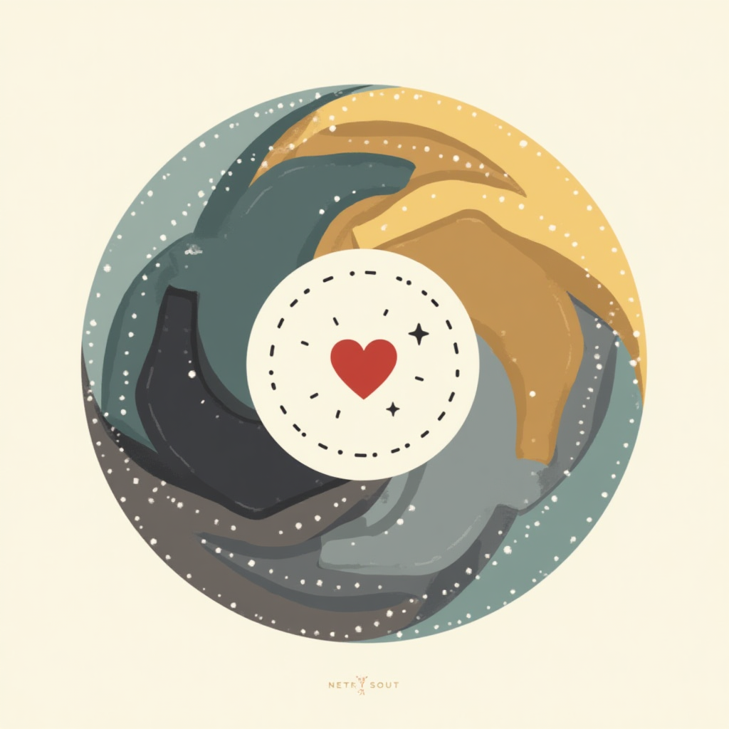
3) Ring + Node (Community)
Subject: 4–5 abstract figures in a ring linked by a heart node; hand silhouette beneath Environment: dotted circle on φ grid Mood: together, uplifting CTA chip: “Share or give” Alt text: “Linked figures around a heart node; CTA chip.”
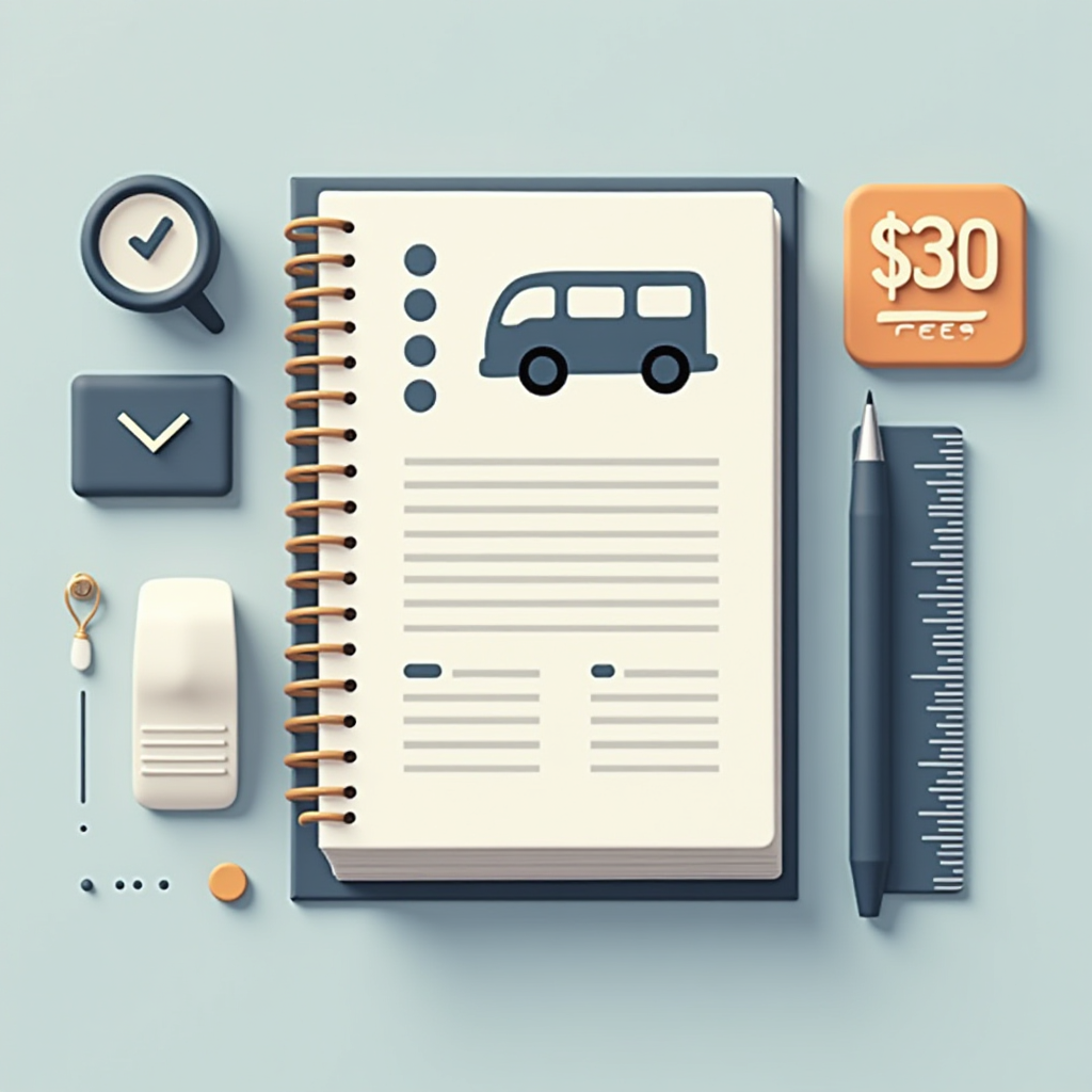
4) Fee Tag (Student Support)
Subject: Stack of books with a small bus icon and a floating fee tag Environment: desk edge line; notebook silhouette Mood: practical, determined CTA chip: “$30 = fees” Alt text: “Books + bus icon with ‘$30 = fees’ CTA.”
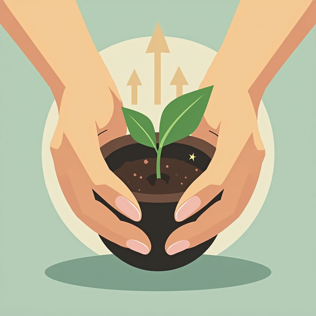
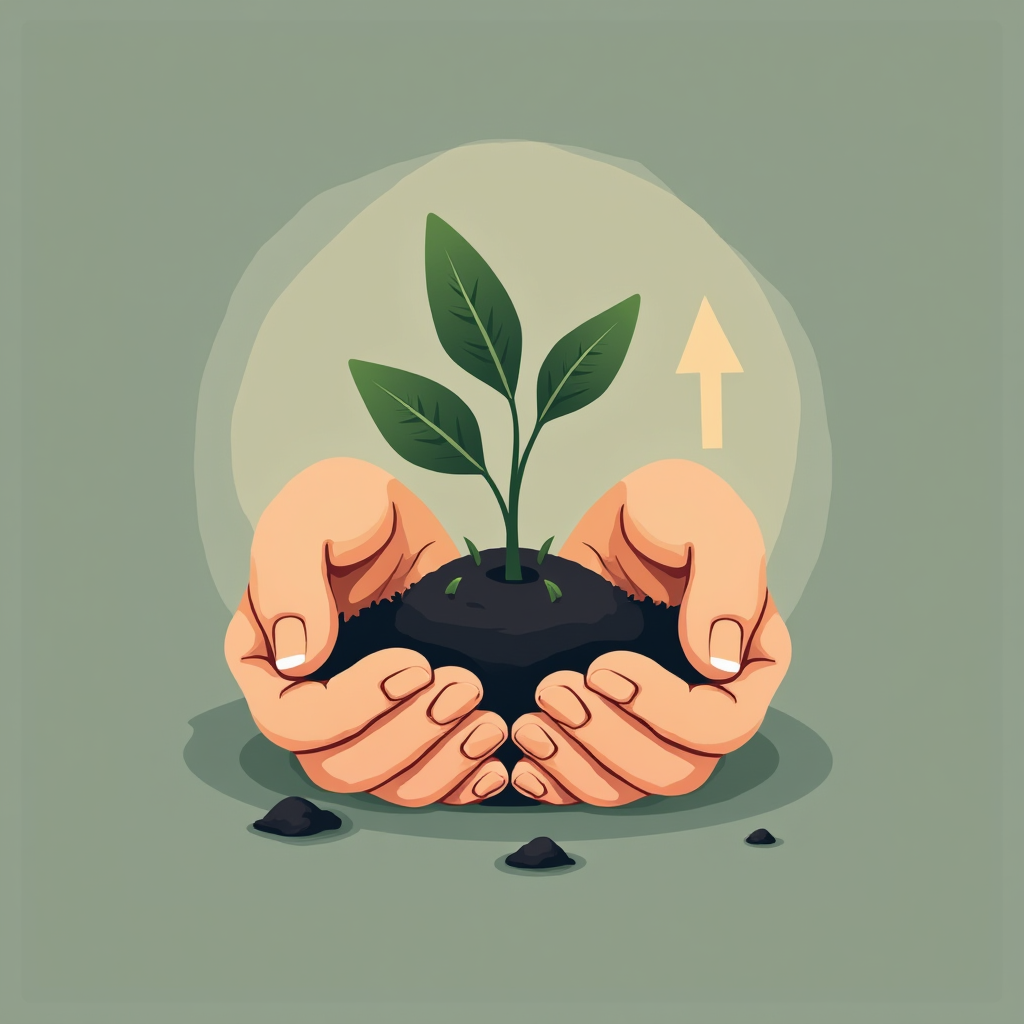
5) Seedling (Growth)
Subject: Small seedling cupped by two hands; subtle upward arrow motif Environment: soft ground plane Mood: hopeful, steady CTA chip: “$10 = 3 seedlings” Alt text: “Seedling in hands on a φ grid with CTA.”
Off-balance? Nudge elements onto the 3/5 and 5/8 lines.
Soft preview on social? Add a 1px inside stroke to key shapes.
Primary CTA
Grab the free templates—copy one, swap your icon, and ship a φ-framed visual today. Reply with your cause or product and I’ll tailor one prompt for you.
— Rev. Brian Scott O’Keefe “Frame clarity, invite action.”
Groceries, Diapers, and a One-Week Plan That Works
A calm, transparent plan for one week—what we’ll buy, what it costs, and how even small gifts make a real dent.
A week we can actually finish
When money is tight, the worst part is the noise—too many choices, not enough margin. This plan is the opposite: seven days, a short list, and totals that add up cleanly. You can pick one item to cover, or share the page to a friend who might.
The one-week plan (line items + totals)
Groceries (7 days)
Base staples (rice, eggs, cooking oil, oats) — $22
Small buffer (prices vary, unexpected needs) — $11 Transport + buffer subtotal:$23
One-week total:$145
These are realistic target amounts for the week. If prices shift locally, we’ll adjust the cart and keep the total within a few dollars by flexing produce and pantry items.
Give options (micro to mini)
$5 — produce top-up (tomatoes, greens)
$7 — covers a day’s lunch
$10 — diapers for two days
$15 — protein for two dinners
$20 — transport + wipes
$30 — fees or a full mid-week grocery run
Any amount helps—sharing helps too.
CTA:Share or give if you can—every small piece makes the week steadier.
What happens when you give
Same-day spend on groceries/diapers first, then transport.
Short receipt log added to this post (item + amount).
Adjust in public: if we can swap a pricier item for a cheaper one, we do it and note it.
How we keep this calm
Seven-day window. No sprawling list, no overwhelm.
Transparent priorities. Food, diapers, then transport.
No guilt tactics. Dignity first. This is a plan, not a panic.
FAQ (short)
Q: What if the total changes? A: We’ll trim non-essentials or scale staples. We’re aiming to stay within $145 ± $10.
Q: Can I sponsor a specific day? A: Yes—comment “Day 3” or “Diapers Fri” and we’ll tag it in the receipt log.
Q: Is sharing useful? A: Sharing is huge. Two shares often equals one covered line item.
Fundraising Visuals That Actually Convert (Free Starter Set)
Five polished prompts for growth, need, and hope—plus clean SVG/PNG export notes so your images look crisp everywhere.
Why these prompts work
Donors decide fast. A clear visual + one focused CTA beats a busy collage. These prompts use:
Golden-ratio layout (φ): natural balance for high scanability.
Clean duotone: recognizable brand feel without distraction.
3–5 props max: a single idea per frame.
Readable CTA chip: the next action is obvious.
Use them as-is in Artistly, then adjust text and palette to your brand.
The 5 Prompts (Copy/Paste for Artistly)
Global defaults (apply to all unless changed): Style: Iconic, flat vector, sleek duotone ramps; crisp 1.5px outlines; geometric simplification Palette: Graphite/ink base; soft gold accent; muted sea-teal secondary Must-haves: Main canvas aspect ≈ φ:1; key anchors at 3/5 and 5/8; 3–5 supportive props; tidy negative space Negative prompts: no photorealism, no minors, no heavy textures, no brand logos, no extra clutter Output: SVG (primary, fully vector) + 2048×2048 PNG (transparent); centered on φ grid; safe margin = 1/φ of canvas Platform: Artistly Seed: genesisSeed=1112
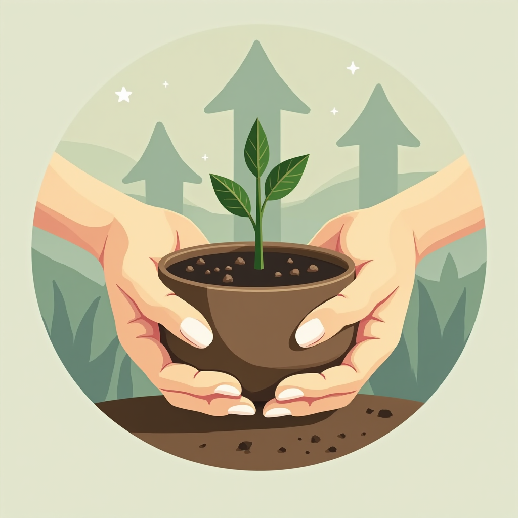
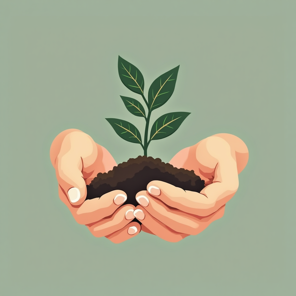
1) Seedling (Growth)
Subject: A small seedling cupped by two hands, with a subtle upward arrow motif in the background Environment: soft ground plane + one sun-ray silhouette Mood: hopeful, growing, steady Must-have CTA: small chip reading “$10 = 3 seedlings” at bottom right
Protect the start. Grow it upward.Plant one and watch it grow—small starts, steady lift.Nurture the start. Let the light do the rest.Start small, nurture consistently, grow steady.
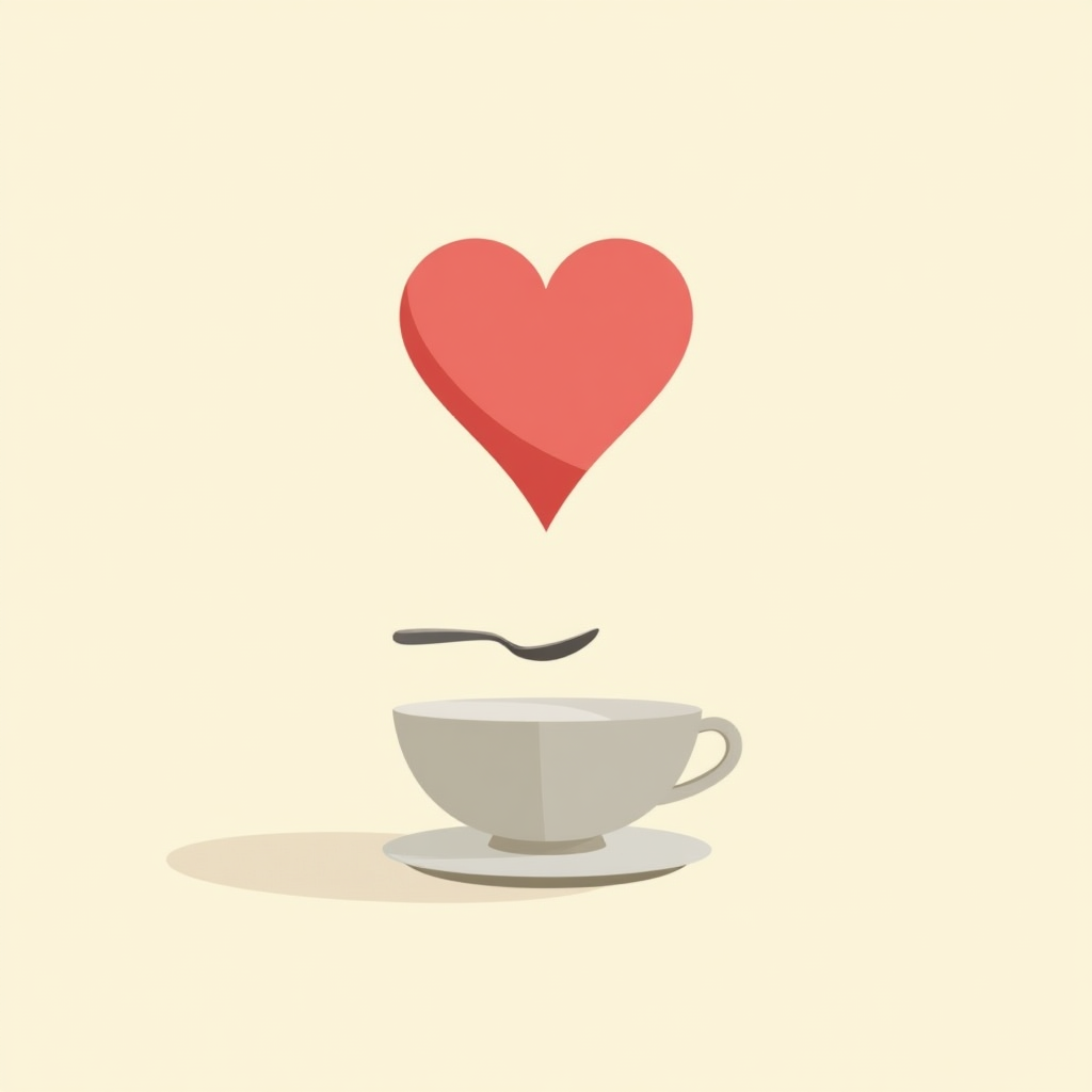
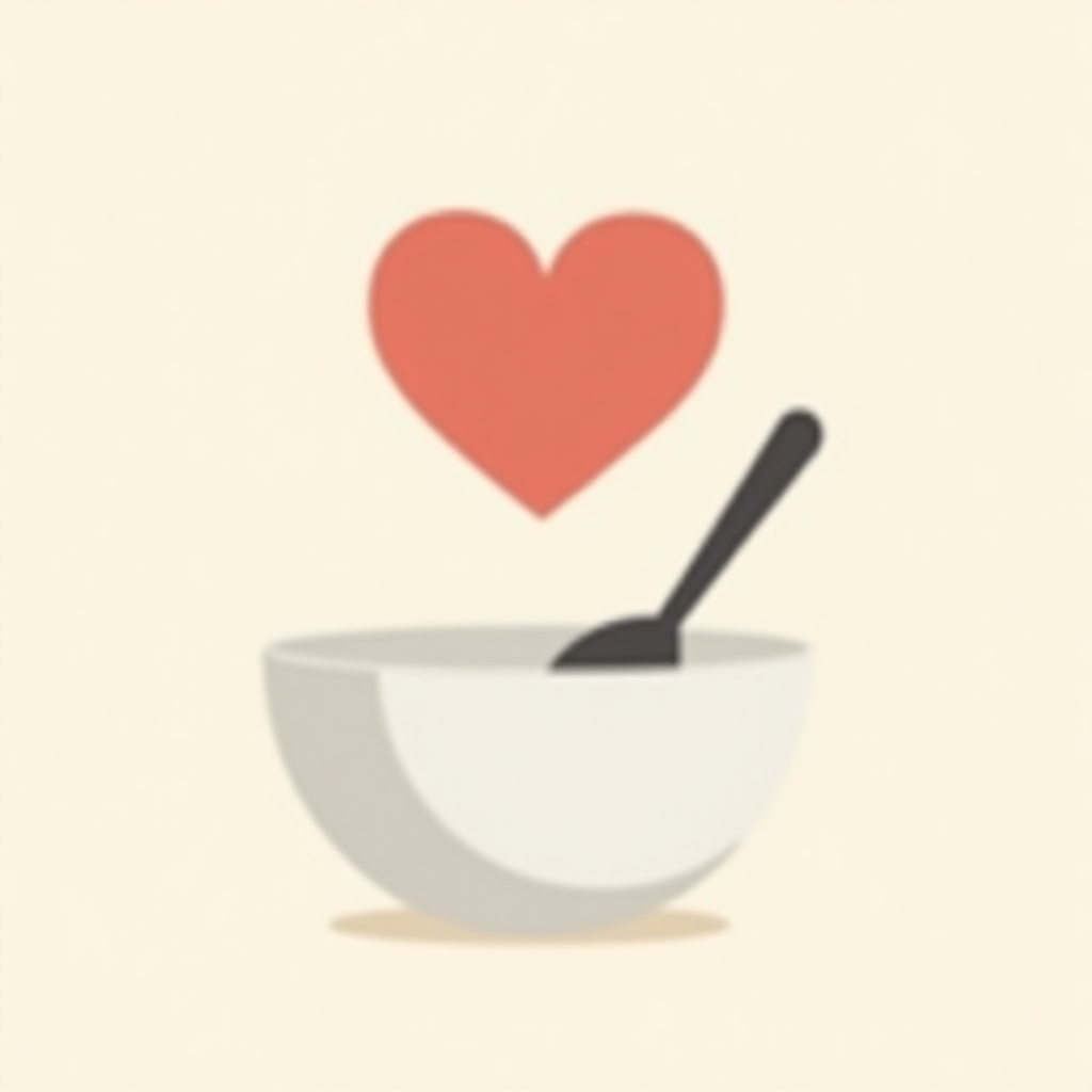
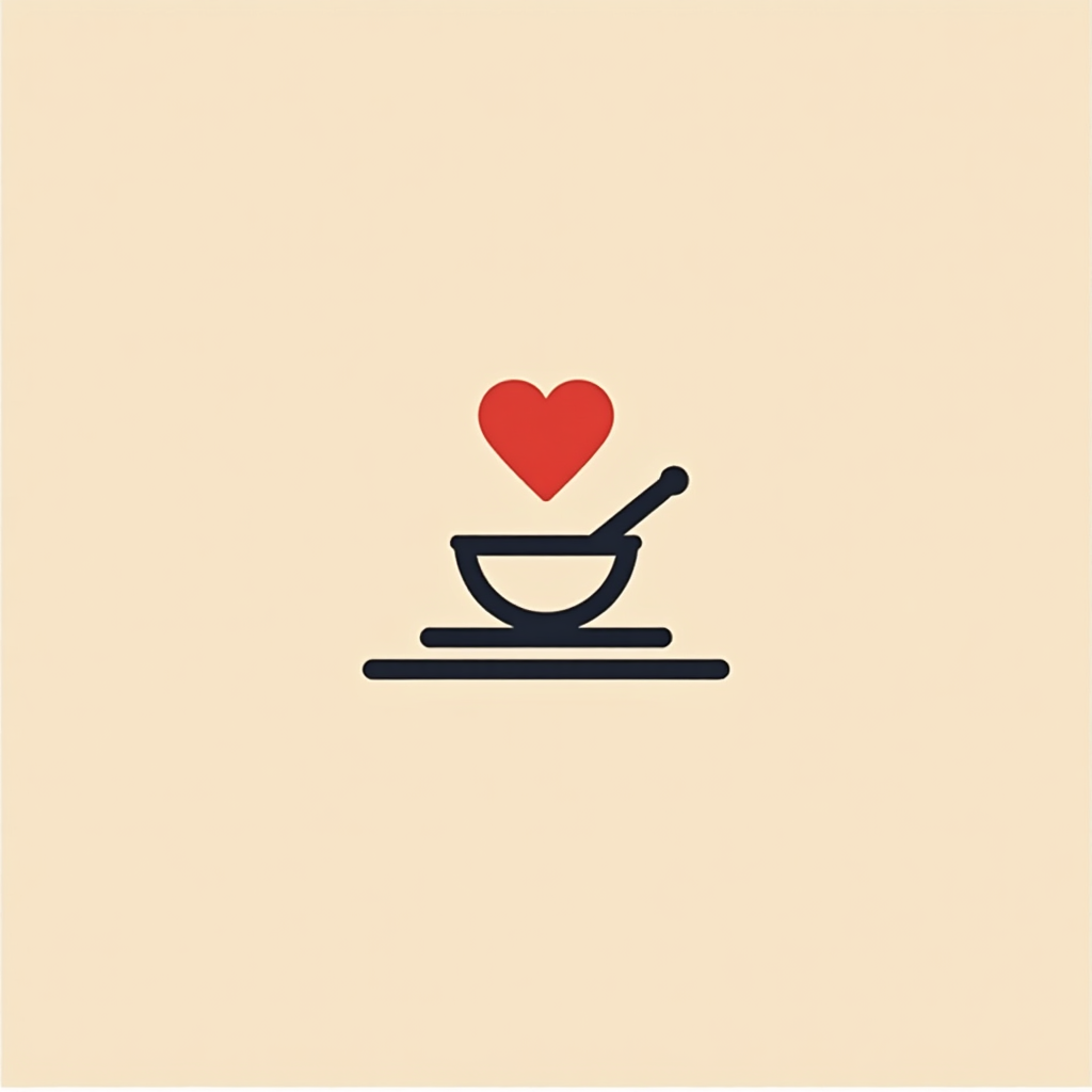
2) Heart + Bowl (Need)
Subject: A simple heart icon above a small bowl/cup, hinting hunger with dignity Environment: tabletop line + one spoon silhouette Mood: quiet need, respect Must-have CTA: chip: “$7 = today’s lunch”
A cup, a spoon, a heart—what we need isn’t fancy, just real.A heart and a simple cup—basic care, quietly served.A bowl, a spoon, a little love—basic care made visible.Food, care, love—served simple.
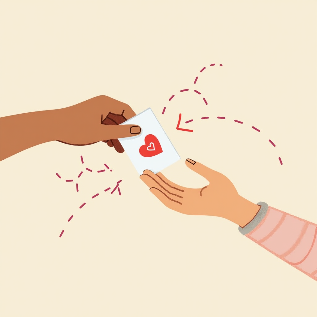
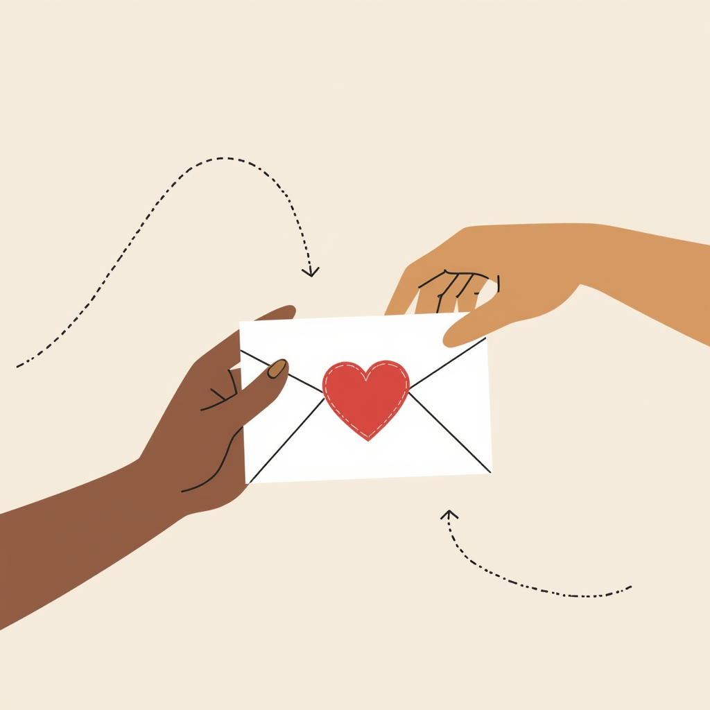
3) Helping Hands (Immediate Help)
Subject: Two hands passing a small envelope with a heart seal (aid) Environment: minimal backdrop + dotted path arc Mood: action, care Must-have CTA: chip: “$20 = transport”
A simple pass: help given, help received.Passing help forward—simple, human, direct.Care passed hand to hand.Passing care, one envelope at a time.
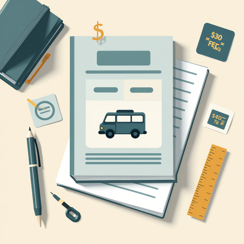
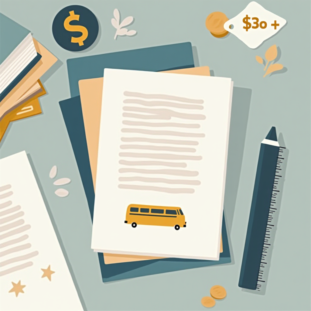
4) Books + Bus (Student Support)
Subject: Stack of books + bus icon; a simple fee tag glyph floating Environment: desk edge line + notebook silhouette Mood: determined, practical Must-have CTA: chip: “$30 = fees”
Covering fees, rides, and supplies so students can actually learn.Small fees, big barriers—help cover the basics so learning can happen.Bus fare, fees, supplies—cover the everyday costs so students can show up.Small fees add up—bus fare, forms, and supplies.
5) Community Circle (Shared Hope)
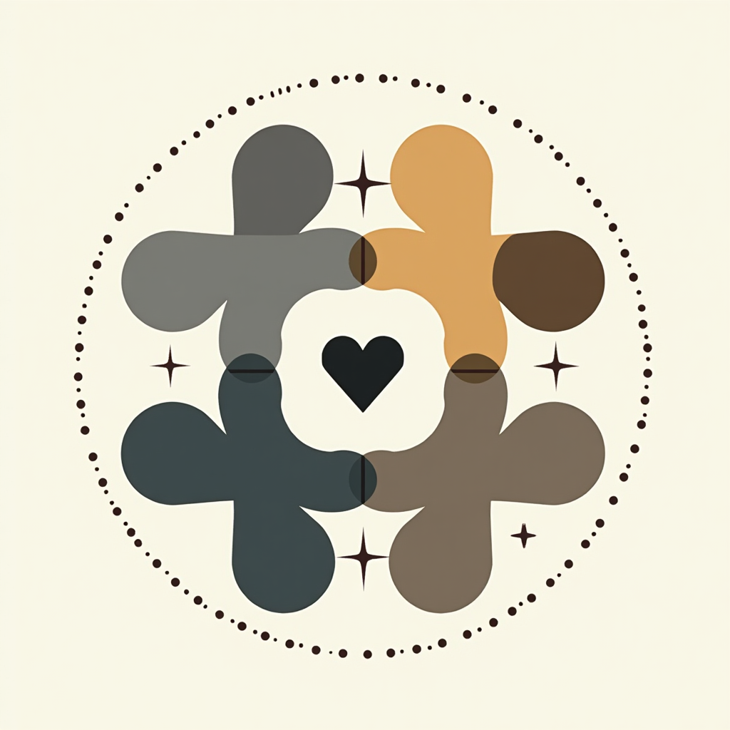
Subject: Simple ring of 4–5 abstract figures linked by a heart node Environment: dotted circle on φ grid Mood: together, uplifting Must-have CTA: chip: “Share or give”
Many hands, one center—holding hope together.Many rays, one heart—hope carried together.Together, we make the center stronger.Many hands, one heart.
Text Overlays (keep it simple)
Primary line: 3–5 words max (“Stand with Elissa”, “Groceries Today”, “Bus Pass Fund”).
Secondary line: 1 short benefit or total (“$7 covers lunch”).
CTA chip: action + micro-amount (“Give $5”, “Share now”). Use a high-contrast chip with rounded corners; avoid more than two chip colors in one frame.
Export Notes (SVG/PNG that stay crisp)
SVG (primary):
Use solid fills + strokes; avoid complex gradients for small social previews.
Ensure text is outlined (paths) or use a web-safe font; keep stroke width at or above 1.2px.
PNG (secondary 2048×2048):
Export with transparent background when used over your site’s theme; otherwise, ink/graphite background is fine.
Keep the safe margin ≈ 1/φ of canvas so captions and chips don’t clip in social crops.
If your platform recompresses aggressively, add a subtle 1px inside stroke on key shapes for edge integrity.
Accessibility:
Maintain contrast ratio ≥ 4.5:1 for text on chips.
Don’t rely on color alone—pair icons with labels (e.g., heart + “Give”).
Provide alt text (sample below).
Alt Text Templates (swap nouns + amounts)
“Hands cupping a small seedling on a golden-ratio grid with a ‘$10 = 3 seedlings’ callout.”
“Heart above a small bowl on a tidy desk line, with the caption ‘$7 covers lunch.’”
“Two hands passing an envelope with a heart seal; CTA chip reads ‘$20 = transport.’”
Brand & Palette Tips
Keep your accent color constant across the set (e.g., soft gold for CTAs). Choose one supporting color (sea-teal) for icons, and let graphite/ink carry the base UI lines. Consistency beats novelty in fundraising.
CTA
Grab the starter pack—reply with your cause for a custom line. I’ll tailor one of the prompts to your story and amounts.